
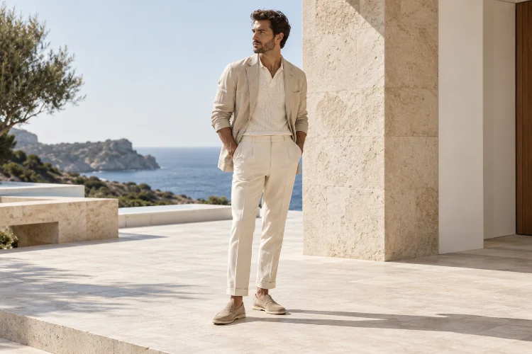
Summer outfits often look simple on the surface, but the most polished ones usually involve more visual planning than they first appear to.
A cream shirt with white trousers, for example, can look incredibly sophisticated even though the colours are almost identical. The difference comes from tonal contrast.
Learning how to use tonal contrast in modern summer fashion outfits is really about understanding how light and dark values interact. Instead of relying on completely different colours, tonal styling uses variations in brightness, depth, saturation, and texture to create interest.
Colour theory describes value as the relative lightness or darkness of a colour, and it plays a major role in establishing contrast and visual depth.
This technique works especially well in summer because lightweight fabrics naturally create soft shadows, movement, and texture. Linen, silk, cotton, raffia, and leather can make even a restrained palette feel layered.
The result is an outfit that feels intentional without looking overly complicated.
1. Understand Tonal Contrast Before Choosing Colours
Tonal contrast is different from regular colour contrast.
A red shirt with green trousers creates strong contrast because the hues themselves are different. Tonal contrast can happen within one colour family simply by changing how light or dark each piece appears.
Imagine pale blue trousers with a navy shirt.
Both pieces belong to the blue family, but the difference in value creates enough separation for the outfit to feel visually structured.
The same principle works with neutrals. Ivory, camel, chocolate, and espresso can sit within one warm colour story while still creating strong depth.
This is why tonal dressing does not necessarily mean wearing one exact shade from head to toe.
In fact, the most interesting tonal looks usually contain several levels of lightness and darkness.
2. Start With a Three-Level Value System
An easy way to experiment with tonal styling is to divide the outfit into light, medium, and dark values.
For example, you could wear white trousers as the lightest element, a beige shirt as the mid-tone, and dark brown sandals as the deepest shade.
The colours remain related, but each section has a distinct visual role.
This method is useful because it prevents a neutral outfit from becoming flat.
You can also apply it to stronger colours.
Try pale green trousers, a medium olive shirt, and dark forest-green accessories. Or combine powder blue, denim blue, and navy.
The eye naturally moves through the different levels of value, creating a more cohessive outfit without the need for bold prints.
This kind of hierarchy is especially effective in minimalist summer wardrobes.
3. Use Light-on-Light Dressing for Soft Summer Elegance
Not all contrast needs to be dramatic.
One of the most elegant summer approaches is combining several pale shades with only small differences between them.
White, cream, ivory, sand, pale grey, and light beige can create a calm tonal look that still feels dimensional.
The key is preventing the pieces from becoming visually identical.
A crisp cotton shirt will reflect light differently from linen trousers, while a woven bag introduces a rougher surface beside smoother fabrics.
That texture creates natural shadow.
Harper’s Bazaar has long highlighted monochromatic dressing as a high-impact styling approach even when the colour itself is restrained.
For summer, light tonal palettes also work beautifully because they visually reinforce the breezy, relaxed feeling of lightweight clothes.
The outfit stays simple, but never empty.
4. Add One Dark Anchor to a Pale Outfit
If an all-light summer outfit feels too soft, add one darker element.
This creates a visual anchor.
Cream trousers, a white tank, and beige sandals might feel understated. Add a chocolate-brown bag and suddenly the outfit gains greater structure.
You can achieve the same effect with a belt, sunglasses, shoes, or even a darker shirt tied around the shoulders.
The dark piece does not need to occupy much space.
In fact, a small amount of depth often works better than splitting the outfit evenly between light and dark.
This technique is especially useful when you want to keep the overall look summery while preventing pale colours from blending together too much.
Think of the darkest shade as punctuation.
It gives the outfit a clear ending point.
5. Use Texture to Strengthen Tonal Differences
Texture becomes extremely important when working with similar colours.
Suppose you wear a cream linen shirt with cream cotton trousers.
The colours may be nearly identical, yet the outfit can still look interesting because linen has a visible irregular texture while cotton may appear smoother and more structured.
Add raffia, suede, woven leather, or silk and the tonal range becomes even richer.
This matters because surface texture changes the way light hits the garment.
A matte fabric absorbs light differently from something glossy. A ribbed knit creates small shadows, while silk produces highlights as it moves.
This is why tonal outfits often look more sophisticated when several materials are involved.
Instead of asking whether the colours are different enough, ask whether the surfaces are different enough.
Texture can create contrast even when the colour difference is very small.
6. Control Saturation Alongside Light and Dark Values
Value is not the only part of tonal contrast.
Saturation matters too.
The Interaction Design Foundation defines saturation as the intensity or purity of a colour, ranging from vivid to more greyed or muted versions.
Consider green.
A muted sage shirt and vivid emerald trousers belong to the same broad colour family, but their saturation difference creates a strong visual effect.
If you want a quieter outfit, keep the saturation levels relatively similar.
For example, dusty blue with muted navy feels refined and low-key.
If you want more energy, introduce one more saturated element.
Spring/Summer 2026 fashion has embraced rich, saturated colour alongside monochromatic dressing, showing that tonal outfits can be either restrained or bold depending on intensity.
Tonal styling is not limited to beige.
It works just as well with red, green, purple, or blue.
7. Try Dark Tonal Dressing in Summer
Summer wardrobes are often dominated by white and pale neutrals, but dark tonal dressing can look equally sophisticated.
Try navy with washed blue-black, charcoal, or deep indigo.
Chocolate brown can be combined with caramel and tan. Deep olive can work with softer khaki or sage.
The important consideration is fabric.
Dark colours absorb more visible light, so lightweight construction and breathable silhouettes become especially important in hot weather.
Choose linen shirts, fluid trousers, sleeveless tops, or loose dresses rather than heavy structured garments.
This creates an interesting contrast between visually deep colour and physically light fabric.
The result feels modern rather than seasonal in an obvious way.
Dark tonal outfits can also transition easily from afternoon into evening.
8. Use Monochrome as a Starting Point, Not a Limitation
Monochromatic dressing has become increasingly visible again in contemporary fashion.
Vogue’s 2026 styling coverage describes a renewed approach to monochrome in which designers commit fully to one colour story, creating impact through cohesion rather than obvious contrast.
The useful part for everyday styling is that monochrome does not require exact matching.
You can wear different versions of the same colour.
For instance, soft pink shorts could work with a deeper rose shirt and burgundy sandals.
A beige skirt can sit beside an oatmeal top and darker camel bag.
This approach gives you more flexibility because individual garments do not need to be purchased as a set.
What matters is that they feel related.
That makes tonal dressing both practical and highly versitile.
9. Use Tonal Contrast to Control Body Proportion
Colour value can also influence how the eye moves through an outfit.
A lighter top with darker trousers creates a clear division around the waist or hip area.
A darker top with pale trousers reverses that visual emphasis and places more weight on the upper body.
You can use this deliberately.
If you are wearing wide trousers, a slightly darker fitted top can provide definition. If your outfit includes a structured upper layer, lighter trousers may keep the lower half visually open.
This is not about creating artificial body-shape rules.
It is simply about understanding where contrast appears.
The strongest tonal break often becomes one of the first things the eye notices.
Knowing that gives you more control over the silhouette.
10. Let Current Colour Trends Inspire the Palette
Colour trends can be useful sources of inspiration without becoming strict instructions.
Pantone’s Spring/Summer 2026 London palette combines airy blue, smoky lilac, caramel, earthy green, expressive brights, and practical neutrals.
That range offers plenty of opportunities for tonal styling.
For example, Burnished Lilac can move toward deeper violet, while Caramel can be combined with cream and chocolate. Dutch Canal blue could sit within a broader blue tonal outfit.
Vogue has also highlighted rich colour saturation, primary combinations, and monochrome dressing as major elements of current fashion.
The useful lesson is not to buy every trending shade.
Instead, find one colour family you already enjoy and explore its lighter, darker, softer, and more saturated versions.
That creates a more personal and harmonius wardrobe.
Using tonal contrast in modern summer fashion is one of the easiest ways to make simple outfits feel more considered. The technique relies on differences in value, saturation, texture, and visual weight rather than constant colour changes.
Start with one colour family, then introduce lighter and darker variations. Use texture to separate similar shades, add one deep anchor when pale outfits feel flat, and experiment with saturation when you want more energy.
Most importantly, stop thinking of tonal dressing as perfect colour matching.
The most interesting summer looks often come from slight differences.
Open your wardrobe and group similar shades together. You may already have several strong tonal combinations waiting to be styled.