
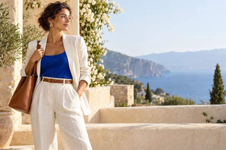
Summer creates the perfect excuse to wear more colour, but adding brighter shades does not automatically create a better outfit. Sometimes a simple combination of cream, blue, and brown looks far more sophisticated than an entire wardrobe of competing tropical hues.
The difference usually comes down to colour relationships.
Understanding advanced colour theory techniques for sophisticated summer style helps you move beyond basic advice like “wear bright colours in warm weather.” Instead, you can think about saturation, value, temperature, contrast, and where each colour sits within the overall outfit.
These principles are particularly useful now because expressive colour has become increasingly visible in contemporary fashion.
Vogue’s 2026 coverage highlights saturated shades, primary colour blocking, monochrome dressing, and unexpected combinations, while Pantone’s Spring/Summer 2026 report presents a broad mix of expressive and seasonless colours.
The goal, however, is not to copy trends. It is to understand colour well enough to make almost any palette feel intentional.
1. Think Beyond Hue: Use Value and Saturation
Most people think about colour primarily in terms of hue: blue, red, green, yellow, and so on.
But two additional qualities can completely change how a colour behaves.
Value describes how light or dark a colour appears, while saturation describes its intensity. A vivid cobalt blue and a dusty blue may belong to the same basic colour family, yet they create very different visual effects.
The Interaction Design Foundation identifies hue, value, and saturation as fundamental components for understanding colour relationships.
This becomes extremely useful in summer outfits.
If bright orange trousers feel overwhelming, you do not necessarily need to abandon orange. Try a softer terracotta or peach instead.
Similarly, a pale blue shirt can feel understated beside cream trousers, while highly saturated blue creates considerably more contrast.
Sophisticated colour styling often involves adjusting intensity rather than eliminating colour altogether.
2. Use Analogous Colours for Easy Summer Harmony
Analogous colours sit next to each other on the colour wheel.
Blue and green are one example. Red, orange, and warm pink can form another family.
Because these colours are closely related, they naturally create relatively smooth visual transitions. Adobe describes analogous schemes as combinations of neighbouring hues that tend to feel harmonious and pleasing.
This technique is excellent for summer because it allows you to wear multiple colours without making the outfit feel chaotic.
Imagine turquoise trousers with a soft blue shirt and teal sandals. There are several colours present, but their relationship keeps the look controlled.
You can also reduce saturation for a quieter result.
Sage green, pale aqua, and washed blue produce a softer version of the same principle.
When you want colour without obvious colour blocking, analogous dressing is one of the easiest routes to a sofisticated palette.
3. Use Complementary Colour in Small Doses
Complementary colours sit opposite each other on the colour wheel. Examples include blue and orange or red and green.
That opposition creates strong visual contrast. Adobe notes that complementary colours produce high contrast and significant visual energy.
For fashion, the important question is scale.
Wearing equal amounts of two intense complementary colours can feel dramatic. That might be exactly what you want, but it is not the only option.
A more understated technique is using one colour as the foundation and its complement as an accent.
For example, wear a blue linen dress with a small orange bag. Pair olive-green trousers with burgundy sandals. Combine a soft lilac shirt with muted yellow accessories.
Because the second colour occupies less visual space, you keep the energy of complementary contrast without allowing the outfit to become too loud.
This is particularly effective with accessories because bags, scarves, sunglasses, and footwear are easy places to experiment.
4. Control Colour Temperature for a More Cohesive Look
Colours are often described as warm or cool.
Reds, oranges, and yellows usually feel warmer, while blues, greens, and many purples feel cooler. However, individual shades can also lean warmer or cooler within the same colour family.
Take white as an example.
A creamy ivory feels warmer than a sharp optical white. Pairing ivory with camel, rust, chocolate, or olive creates a warmer visual story.
Bright white works beautifully with navy, cobalt, icy grey, or cool green for a crisper effect.
You do not always need to keep temperatures identical. Mixing warm and cool colours can create useful tension.
The key is deciding whether that contrast is intentional.
A cool blue dress with warm tan leather sandals works because the brown acts almost like a neutral. Adding several unrelated warm and cool shades, however, can make the outfit harder to read.
Colour temperature is therefore another tool for creating balence, not a strict rule.
5. Master Tonal Dressing Without Looking Flat
Tonal dressing means building an outfit from variations of one colour family.
This is different from wearing exactly the same shade from head to toe.
For example, an outfit could combine cream, ivory, oatmeal, and beige. Another might move from pale blue to denim blue and navy.
The trick is varying value, texture, and sometimes saturation.
A cream linen shirt with ivory trousers and tan sandals avoids looking flat because linen, cotton, and leather reflect light differently.
You can use the same strategy with stronger colours.
Vogue’s 2026 coverage has highlighted monochrome styling alongside rich saturated colour, showing that impactful dressing does not necessarily require multiple competing hues.
Tonal outfits are especially effective when you want sophisticated summer style with minimal effort.
Just remember that monocromatic does not have to mean visually identical.
6. Build an Outfit Around One Saturated Colour
A strong colour often looks more expensive when it has room to dominate.
Current fashion has moved enthusiastically toward saturated colour. Vogue reported rich saturation, primary colour blocking, and bold shades as major themes in 2026, while its summer trend summary noted strong reader interest in vivid hues such as teal and turquoise.
You do not need to reproduce an entire runway palette.
Choose one saturated shade and let neutrals frame it.
Red trousers with a white tank and brown sandals create a clear hierarchy. A bright green dress needs little more than a neutral bag and simple jewelry.
Even traditionally darker colours can work in summer. Harper’s Bazaar highlighted eggplant purple as an unexpected warm-weather shade in 2026, demonstrating how deeper hues can function as alternatives to predictable pale neutrals.
The stronger the focal colour, the less the rest of the outfit usually needs to compete.
7. Use Neutrals as Active Colours, Not Empty Backgrounds
Neutrals are often treated as the absence of colour.
That misses their real styling potential.
Cream, navy, brown, grey, black, olive, and white all influence the temperature and contrast of an outfit. Choosing the right neutral can dramatically change how a bright colour appears.
Consider a red blouse.
Wear it with black trousers and the result feels graphic. Pair it with cream and the same red feels softer. Use chocolate brown and the combination becomes warmer and richer.
Vogue’s recent guidance on introducing colour into predominantly dark wardrobes also demonstrates how a single coloured shirt, bag, skirt, or dress can alter an otherwise neutral foundation.
This is useful if you are hesitant about bold colour.
Instead of rebuilding your wardrobe, keep the neutral clothing you already wear and experiment with one strong addition.
The surrounding neutral does most of the work.
8. Create Contrast Through Accessories First
If unusual colour combinations still feel intimidating, accessories provide the lowest-risk testing ground.
Start with a neutral summer outfit: white shirt, cream trousers, tan sandals.
Now introduce a red bag.
Then try cobalt earrings or green sunglasses instead.
Because accessories occupy relatively little visual space, you can test surprisingly adventurous combinations without committing to an entire garment.
This reflects one of the simplest ways contemporary fashion is incorporating colour. Vogue’s 2026 coverage includes colourful accessories and strategic pops of strong hues as approachable ways of moving beyond neutral wardrobes.
Once you find a combination that feels harmonius, scale it up.
A colour that first appeared in your handbag might eventually become trousers, a skirt, or a complete dress.
Colour confidence often develops gradually.
Sophisticated summer colour is not about wearing the brightest possible palette. It comes from understanding relationships between hue, value, saturation, temperature, and contrast.
Analogous colours can create smooth harmony, complementary shades introduce energy, tonal dressing produces visual continuity, and neutrals help stronger hues feel more controlled. The most useful strategy is to decide which colour deserves attention before building everything else around it.
Start experimenting with clothing you already own. Change one accessory, combine two neighbouring colours, or replace black with a softer neutral and observe how the outfit changes.
Once you understand why certain combinations work, colour becomes less intimidating – and far more useful as a tool for developing a distinctive summer style.