
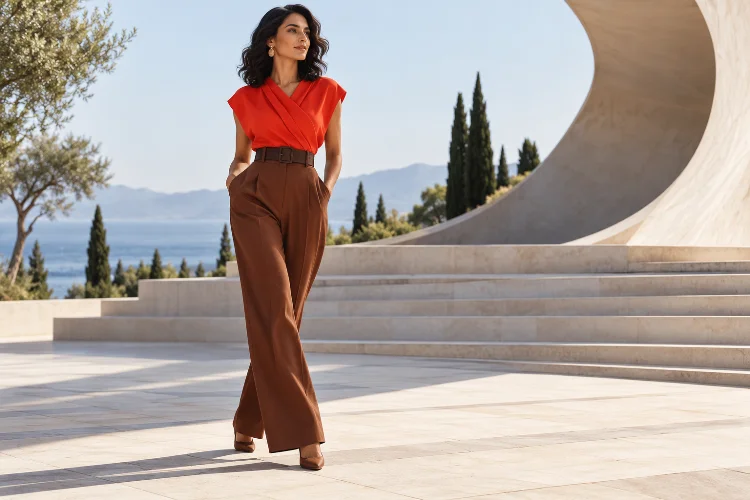
Colour can change the shape of an outfit before you alter a single garment. Put a bright shade near the shoulders and attention naturally moves upward.
Add a dark belt between two lighter pieces and the waist suddenly becomes a strong visual break. Keep trousers and shoes within one colour family, and the lower half can appear more continuous.
This is where strategic colour placement for more balanced summer silhouettes becomes useful.
Instead of choosing colours purely because they look good together, advanced styling considers where those colours appear and how much visual attention each one receives. Value, saturation, temperature, proportion, and contrast can all influence how the eye travels through an outfit.
Colour theory supports this idea. Value describes relative lightness and darkness, while saturation describes intensity; both are important tools for establishing visual hierarchy and depth.
Once you understand placement, even basic summer pieces can create noticeably stronger proportions.
1. Decide Where You Want the Eye to Land First
Every outfit has a visual focal point, whether you deliberately create one or not.
A bright yellow shirt with beige trousers naturally directs attention toward the upper body. Reverse that combination with a neutral shirt and vivid trousers, and the focus shifts downward.
This matters because saturated colour has greater visual energy than many muted shades.
Current fashion provides plenty of examples. Vogue’s 2026 coverage notes that rich saturation, monochrome styling, and primary colour blocking have become important elements of contemporary dressing.
Rather than scattering several equally strong colours around the outfit, decide where the main focus belongs.
Perhaps you want a sculptural neckline to stand out. Use colour near the shoulders and keep the lower half quieter.
If your wide-leg trousers are the strongest piece, reverse the strategy.
Intentional focal placement gives the entire silhoutte clearer direction.
2. Use Dark and Light Values to Divide the Body
One of the simplest tools in colour placement is value contrast.
Value refers to how light or dark a colour appears. High value contrast creates a stronger visual boundary, while similar values produce smoother continuity.
Imagine a white tank tucked into black trousers.
The strong light-dark break makes the waist immediately noticeable because the eye sees a clear horizontal division.
Now replace the black trousers with cream. The boundary becomes softer, creating a longer visual flow between the upper and lower body.
Neither approach is automatically more flattering.
They simply produce different effects.
Use strong contrast when you want to emphasise where one garment ends and another begins. Choose low contrast when you prefer a smoother, more elongated appearance.
This is particularly useful during summer, when outfits contain fewer layers and colour boundaries become much more visible.
3. Keep Similar Colours Together for Vertical Continuity
If you want an outfit to appear visually uninterrupted, place similar values or related hues vertically.
For example, navy trousers paired with a medium-blue top create less interruption than navy trousers worn with a bright white shirt.
The same idea works with shoes.
Cream trousers flowing into beige or nude-toned sandals maintain greater continuity than cream trousers paired with strongly contrasting black footwear.
Monochromatic colour schemes are built around variations of one base hue, while analogous schemes use neighbouring colours to create cohesion. Adobe identifies both approaches as established colour-harmony structures.
You do not need identical shades.
Powder blue, denim blue, and navy can create a long connected line despite having obvious differences in depth.
Vertical colour continuity is especially effective with wide trousers, maxi dresses, and long skirts because these garments already create strong downward movement.
4. Place High Saturation Where You Want More Visual Weight
Saturation describes how vivid or muted a colour appears.
A saturated emerald usually attracts more attention than a greyed sage green, even if the two garments are the same size.
This means colour intensity can help redistribute visual weight.
If an oversized skirt dominates your silhouette, a saturated top can create enough visual strength above the waist to restore balence.
Alternatively, if you are wearing a dramatic bright shirt, keeping the trousers muted prevents the two halves from competing.
Pantone’s Spring/Summer 2026 London palette demonstrates how bright Mandarin Orange and Teaberry can coexist with restrained shades such as Shale Green, Angora, Ether, and White Onyx.
That mix offers a useful lesson for everyday outfits: saturation does not need to be equal everywhere.
One intense shade often works better when supported by quieter colours.
5. Use Colour Blocking to Reshape Proportion
Colour blocking can do much more than make an outfit look bold.
The location of each block creates visual architecture.
A contrasting waistband places a horizontal line through the centre of the outfit. Different colours between a shirt and shorts create separate upper and lower sections.
A dress containing vertical side panels can encourage the eye to move differently from one built around horizontal colour divisions.
Modern colour blocking often works best when one shade provides the foundation and another appears more selectively.
Vogue recently described a 2026 colour-blocked look in which one grounding colour dominated while a second bright shade provided controlled contrast, producing a refined rather than chaotic result.
That principle translates easily into summer dressing.
Try olive trousers and a green top with a small cobalt layer or accessory. The related greens create the foundation while blue interrupts the outfit strategically.
Colour blocking becomes more sophisticated when it supports proportion rather than simply maximising contrast.
6. Use Accessories to Redirect Visual Attention
Accessories provide one of the easiest ways to move colour around an outfit.
Consider an otherwise neutral combination of a white shirt and beige trousers.
Add red earrings and attention travels upward toward the face. Replace them with red sandals and the colour now anchors the lower part of the outfit.
A colourful belt draws attention toward the waist, while a shoulder bag can place visual weight somewhere between the upper body and hip.
This is useful because accessory placement is easy to change.
You can experiment with a bright colour without committing to an entire garment.
Adobe’s colour guidance recommends establishing a dominant shade and using supporting or accent colours in smaller proportions to create hierarchy rather than allowing everything to compete equally.
Apply the same idea to fashion.
One carefully positioned accent often creates more impact than five colourful accessories scattered across the outfit.
7. Control Horizontal Colour Breaks Around the Waist and Hips
Horizontal contrast deserves particular attention because it can strongly divide a silhouette.
A bright shirt tucked into dark shorts creates an obvious boundary at the waist. A long shirt in a similar shade to the trousers creates much less interruption.
Neither is inherently better.
A strong waist contrast works well when you want to define the midpoint of an outfit. It can also make high-waisted trousers or tailored shorts more noticeable.
For a softer line, use related colours.
Try an ivory shirt with light beige trousers instead of white with black. You still have enough separation to see the garments clearly, but the transition is gentler.
The same principle applies around the hips.
A sharply contrasting long top that ends exactly at the hip creates a noticeable horizontal line. Choosing a shade closer to the trousers reduces that emphasis.
Strategic placement is therefore partly about deciding which garment edges you want people to notice.
8. Use Warm and Cool Colours to Shift Emphasis
Value and saturation are not the only tools that influence visual attention.
Colour temperature matters too.
Warm colours such as red, orange, and yellow often feel energetic, while cooler blues and greens can create a different visual mood. Colour theory also treats temperature as an important component of colour harmony.
You can use this contrast deliberately.
Imagine cool navy trousers with a warm coral shirt. The temperature change reinforces the division between the two sections.
Alternatively, use cool colours throughout for greater continuity and introduce one warm accessory as the focal point.
Current Spring/Summer palettes frequently combine warmer and cooler families rather than choosing only one side. Pantone’s 2026 London report, for instance, places Mandarin Orange and Caramel beside Dutch Canal blue, Burnished Lilac, and Shale Green.
Temperature contrast therefore becomes another way to control attention.
9. Let Neutral Colours Carry More of the Outfit
Strategic colour placement becomes harder when every garment demands attention.
Neutrals solve this problem.
White, cream, beige, brown, grey, navy, and similar shades can provide large areas of visual quiet around stronger colours.
Pantone’s 2026 seasonal report explicitly includes a group of seasonless foundational shades such as Angora, White Onyx, Chocolate Truffle, Ether, and Evening Blue alongside brighter seasonal colours.
A simple summer formula is to let neutrals occupy most of the silhouette and reserve stronger colour for one strategic area.
For instance, cream trousers and a white shirt become more directional with green shoes. Beige shorts and a neutral tank gain upper-body emphasis through a vivid blue overshirt.
This makes the outfit feel cohessive while preserving a clear visual hierarchy.
10. Check the Outfit From a Distance
The final test for colour placement is surprisingly simple.
Step several feet away from the mirror.
From a distance, small design details disappear and the major colour blocks become much easier to see.
Ask yourself where your eyes land first. Then notice where they move next.
If every section competes equally, reduce the satruation of one piece, remove an accent, or replace a strong contrast with a related colour.
If everything blends together too much, introduce one deeper value or stronger focal point.
The goal is not perfect symmetry.
Balanced summer styling usually depends on intentional asymmetry – one dominant area, one supporting section, and perhaps one smaller accent.
Once the colour hierarchy makes sense from across the room, it will usually look even stronger up close.
Strategic colour placement allows you to influence summer silhouettes without changing the clothes themselves.
Light-dark contrast can define the waist, related colours create vertical continuity, saturated shades direct attention, and accessories can move visual emphasis around the body.
The most effective approach is to decide where you want the eye to travel before adding stronger colours.
Experiment with clothes already in your wardrobe. Move a bright shade from the top to the shoes, replace a contrasting waistband with a tonal one, or extend one colour vertically through trousers and footwear.
Small adjustments in placement can dramatically change the balance of an outfit. Once you start viewing colour as part of silhouette design, summer styling becomes much more precise – and far more creative.