
Some summer outfits contain several beautiful colours and still feel disconnected. Others combine three or four shades yet somehow look completely effortless.
The difference is usually not the individual colours. It is the relationship between them.
Understanding advanced colour relationships for building cohesive summer looks allows you to move beyond simply matching a top with trousers. Instead, you begin thinking about harmony, contrast, saturation, visual hierarchy, and how one colour changes when placed beside another.
Traditional colour theory provides useful starting points through analogous, complementary, split-complementary, triadic, and monochromatic relationships.
Adobe and the Interaction Design Foundation both describe these systems as structured ways of creating harmony or purposeful contrast.
The interesting part begins when those principles move from a colour wheel into an actual wardrobe.
Once you understand the relationships, summer colour becomes much easier to experiment with – and far less dependent on copying temporary trends.
1. Start With a Dominant Colour, Not Five Equal Ones
One of the simplest ways to create cohesion is deciding which colour controls the outfit.
That colour does not necessarily need to be the brightest. It simply needs to occupy the largest amount of visual space.
Imagine cream wide-leg trousers with an ivory shirt, green sandals, and a red bag. If cream and ivory make up roughly three-quarters of what you see, they act as the dominant colour family while green and red function as accents.
Without hierarchy, every shade competes.
This becomes particularly important when using saturated colours. Vogue’s 2026 fashion coverage notes the popularity of rich saturation, monochrome dressing, and strong primary colour blocking, demonstrating how powerful colour becomes when its role within the outfit is clear.
Before adding another shade, ask which colour should be noticed first.
That decision alone can make a complicated palette feel more cohessive.
2. Use Analogous Colours for Natural Harmony
Analogous colours sit beside each other on the colour wheel.
Examples include blue with blue-green, yellow with yellow-orange, or red with reddish purple. Because neighbouring hues share visual characteristics, they tend to create softer transitions than strongly contrasting combinations.
The Interaction Design Foundation describes analogous schemes as naturally harmonious and visually comfortable, making them particularly useful when you want multiple colours without dramatic tension.
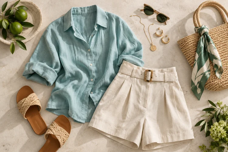
In summer fashion, try combining pale blue trousers with a turquoise shirt and teal accessories.
For something warmer, pair peach with coral and soft orange.
You can also reduce the intensity by choosing muted versions. Sage, dusty aqua, and washed blue create an analogous palette that almost behaves like tonal dressing.
The effect feels colourful without looking busy.
3. Make Complementary Colours Unequal
Complementary colours sit opposite each other on the colour wheel and naturally create strong contrast.
Think blue and orange, yellow and violet, or red and green.
Adobe notes that complementary pairings create high visual energy because the colours oppose one another.
That energy is useful, but wearing equal quantities of two intense complementary colours can sometimes overwhelm an everyday outfit.
A more sophisticated technique is changing the proportion.
Wear a cobalt-blue dress with a small orange bag. Combine olive trousers with a burgundy-red sandal. Let one colour occupy most of the outfit while the opposite hue appears only as an accent.
This creates the excitement of contrast without making the outfit look like a colour-theory demonstration.
Accessories are particularly useful here because they allow strong colour relationships in relatively small doses.
4. Try Split-Complementary Palettes for Softer Contrast
If complementary colour feels too aggressive, split-complementary styling provides an interesting alternative.
Instead of pairing one colour directly with its opposite, you use the two shades positioned beside that opposite.
The Interaction Design Foundation explains that this approach preserves contrast while making the relationship less intense than a straightforward complementary scheme.
For example, instead of placing blue directly against orange, you could explore blue with yellow-orange and red-orange variations.
In fashion, you do not need to reproduce the colour wheel exactly.
A navy dress with rust sandals and a warm yellow bag can achieve a similar effect. The palette contains contrast but remains easier to wear than three equally saturated primary colours.
Split-complementary relationships are especially useful when you want a summer outfit to feel creative rather than perfectly matched.
5. Use Tonal Dressing to Create Visual Continuity
Tonal dressing is one of the easiest ways to make summer clothing look sophisticated.
Instead of using identical colours, combine different values and intensities from the same general family.
An outfit might include ivory trousers, a cream shirt, a pale beige bag, and caramel sandals. Another could move from powder blue through denim blue into navy.
Adobe identifies monochromatic colour schemes as one of the fundamental harmony structures available when building palettes.
The secret to keeping tonal outfits interesting is texture.
A linen shirt reflects light differently from silk, leather, cotton, or raffia. That means several similar shades can still create considerable visual depth.
For summer, this technique is particularly useful because lightweight fabrics naturally produce movement, shadow, and texture.
A restrained palette therefore does not have to feel flat.
6. Control Saturation Before Changing the Colour
When two colours seem difficult together, people often assume the hues themselves are incompatible.
Sometimes the real problem is saturation.
Imagine vivid purple trousers with an equally electric yellow top. The relationship is intense because both colours demand immediate attention.
Now soften the purple into lavender and reduce the yellow to butter or pale banana.
The relationship remains, but the visual volume becomes much quieter.
Pantone’s Spring/Summer 2026 London palette demonstrates this kind of range, combining brighter shades such as Mandarin Orange and Teaberry with softer Pale Banana, Burnished Lilac, Dutch Canal blue, and grounded seasonless neutrals.
This is useful for everyday styling.
You can keep an interesting colour combination and simply lower the satruation of one element.
Often that is enough to restore balance.
7. Treat Neutrals as Part of the Colour Relationship
White, cream, beige, brown, navy, grey, and black are not empty backgrounds.
They actively change how surrounding colours look.
Take tomato red.
Placed beside black, it feels graphic and dramatic. Next to cream, it becomes warmer and softer. With chocolate brown, the entire palette feels richer and more earthy.
Pantone’s current seasonal palette similarly positions shades such as Angora, White Onyx, Chocolate Truffle, Ether, and Evening Blue as foundations that support more expressive colours.
That is exactly how neutrals should function in a wardrobe.
Instead of automatically using black or white with every strong colour, test alternatives.
A turquoise dress may become more relaxed with tan accessories, sharper with white, or deeper with navy.
Changing the neutral can transform the relationship without changing the main colour at all.
8. Use a Three-Colour Formula Without Looking Overstyled
Three-colour outfits can feel sophisticated when each shade has a different job.
One useful approach is dominant + supporting + accent.
Imagine navy trousers as the dominant colour, a pale blue shirt as the supporting shade, and red sandals as the accent.
The colours do not occupy equal visual space, which makes the outfit easier to process.
A triadic scheme takes this concept further by using three colours spaced around the colour wheel. The Interaction Design Foundation describes triadic relationships as vibrant but balanced when handled carefully.
In clothing, full-strength triadic combinations can become intense, so modify saturation.
Try muted green, dusty orange, and soft violet rather than their most vivid equivalents.
This keeps the relationship interesting without turning every garment into a statement piece.
9. Repeat Small Colours to Connect Separate Pieces
Colour repetition is one of the easiest advanced styling tricks.
Suppose you wear cream trousers, a green patterned blouse, brown sandals, and a handbag containing a small green detail.
That repeated green creates a visual connection between the upper and lower parts of the outfit.
The repetition does not need to be exact.
A turquoise earring can echo the blue-green found in a print. Brown sunglasses might connect visually with tan shoes.
This technique is particularly useful with printed summer clothing.
Instead of trying to match every colour in a floral dress, select one minor shade from the print and repeat it somewhere else.
That small connection makes the outfit appear more harmonius even when several colours are present.
10. Let Trends Suggest Colours, Not Dictate Relationships
Seasonal trend reports can be useful sources of inspiration, but the strongest wardrobe colour systems survive beyond one summer.
Pantone’s Spring/Summer 2026 palette mixes expressive brights, softer mid-tones, and practical neutrals rather than promoting one single dominant shade.
Vogue likewise reported that saturated colour, quirky combinations, and monochrome dressing were all visible within the same season.
That variety is useful because it reinforces an important point: there is no single correct summer palette.
The relationship matters more than the trend.
A colour you already own can feel completely current when paired differently.
Instead of buying a new wardrobe every season, experiment with how existing shades interact through proportion, saturation, contrast, and repetition.
That usually produces more distinctive personal style than simply wearing whatever colour happens to be popular.
Building cohesive summer looks is less about finding colours that “match” and more about understanding what each shade contributes.
Analogous combinations create smooth harmony, complementary and split-compementary relationships introduce contrast, tonal palettes establish continuity, and neutrals give stronger colours room to breathe.
Saturation and proportion then determine how intense those relationships become.
Start with one dominant colour and build outward. Experiment with neighbouring hues, repeat small accent colours, or soften an adventurous combination by reducing saturation.
Most importantly, use colour theory as a framework rather than a strict rulebook. Once you understand the relationships behind successful palettes, you can create summer outfits that feel coordinated, expressive, and distinctly your own.