
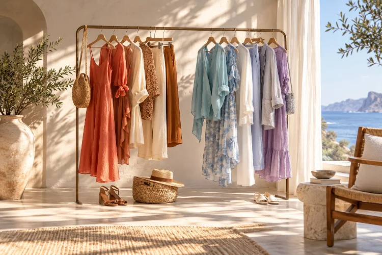
Summer wardrobes usually become lighter, brighter, and more colourful, but choosing a seasonal palette involves more than simply adding white, pastels, or tropical shades.
Two outfits can use almost identical colours and still create completely different moods depending on whether those colours lean warm or cool.
That difference comes from colour temperature.
Understanding how seasonal colour temperature influences summer outfit styling gives you a more precise way to combine clothing. Warm coral, for example, creates a different visual relationship with cream than cool raspberry creates with crisp white.
Both combinations can work, but they communicate different levels of softness, energy, and contrast.
Colour theory generally divides the wheel into warmer families such as red, orange, and yellow, and cooler families such as blue, green, and violet. Temperature can influence harmony and perceived mood.
Once you start noticing these relationships, building sophisticated summer colour palettes becomes much easier.
1. Understand That Every Colour Has a Temperature
Warm and cool colour categories sound simple until you start comparing individual shades.
Red is generally considered warm, but a tomato red containing more orange feels warmer than a raspberry red leaning toward blue. Green can feel warm when it approaches olive or chartreuse and cooler when it moves toward teal or emerald.
That variation matters when styling clothing.
Adobe’s colour-wheel guidance describes red, orange, and yellow as warm colours, while blue, green, and violet generally form the cooler side of the spectrum. Mixing the two groups strategically can create balance rather than conflict.
Instead of asking whether you like blue, ask which blue.
A soft turquoise can make a summer outfit feel fresh and coastal. Navy introduces greater depth, while an icy powder blue feels cleaner and quieter.
Thinking in temperature rather than basic colour names creates much more styling flexibility.
2. Let Summer Light Influence Your Palette
Colour never exists in isolation. The surrounding light changes how clothing appears.
Strong summer daylight can make highly saturated colours look particularly intense. Soft neutrals and dusty shades, meanwhile, often become brighter and more dimensional outdoors than they appear beneath artificial store lighting.
This partly explains why colours that seem unusual on a hanger can suddenly make sense during summer.
The Spring/Summer 2026 Pantone palette demonstrates this broad seasonal range. Its London report combines warmer shades such as Mandarin Orange and Caramel with cooler Burnished Lilac, Dutch Canal blue, Amethyst Orchid, and Shale Green, alongside seasonless neutrals.
You do not need to follow those colours literally.
The practical lesson is that modern summer palettes can move comfortably between warm and cool temperatures. What matters is controlling how those temperatures interact within the outfit.
3. Choose Neutrals According to Temperature
Neutrals are not actually neutral in the way most people imagine.
White, beige, grey, brown, navy, and black can all carry noticeable temperature.
Cream and ivory usually feel warmer than optical white. Camel and caramel create warm foundations, while blue-grey and cool taupe produce a more subdued effect.
Pantone’s Spring/Summer 2026 seasonless shades illustrate this range particularly well, moving from soft Angora beige and Chocolate Truffle to cooler Ether blue-grey, White Onyx, and Evening Blue.
This becomes useful when building summer outfits around one stronger colour.
Pair tomato red with cream and tan for warmth. Put the same red beside bright white and navy, and the overall look becomes sharper.
Similarly, pale blue beside cool grey feels restrained, while pale blue combined with caramel creates a stronger warm-cool tension.
Your neutral choice can completely alter the personality of the main colour.
4. Use Warm-on-Warm Combinations for Soft Cohesion
An easy way to create a harmonious outfit is to keep several colours within a similar temperature family.
Warm summer palettes might combine ivory, terracotta, coral, peach, caramel, olive, or buttery yellow.
Imagine cream linen trousers with a peach shirt and brown leather sandals. Although the pieces are different colours, they share enough warmth to create continuity.
This approach works particularly well with natural summer materials such as linen, raffia, and tan leather because their surfaces already carry earthy visual qualities.
The same principle can support brighter looks.
A coral dress with orange-toned accessories can feel intentional rather than overly colourful because both elements live within a related temperature range.
For a more sofisticated finish, vary saturation instead of making every shade equally strong. One saturated colour surrounded by muted warm tones usually creates more depth than several equally intense colours fighting for attention.
5. Build Cool Palettes for a Crisp Summer Effect
Cool palettes produce a noticeably different atmosphere.
Blue, turquoise, violet, lavender, cool green, crisp white, and blue-grey can create outfits that feel fresh and visually clean.
That effect fits naturally with summer dressing.
Try navy trousers with a pale blue shirt and white sandals. Alternatively, combine lavender with cool grey or turquoise with optical white.
The current fashion environment also gives plenty of room for stronger cool shades. Vogue’s 2026 summer coverage noted enthusiasm for vivid teal and turquoise, while contemporary styling has increasingly embraced saturated colour rather than relying exclusively on muted minimalism.
Again, temperature does not mean every piece needs to match perfectly.
A mostly cool outfit can still contain one warm detail. In fact, that interruption often makes the look more interesting.
6. Mix Warm and Cool Colours Through Unequal Proportions
Warm and cool shades do not need to remain separate.
Some of the most interesting outfits come from intentionally placing them together.
The easiest technique is unequal proportion.
Let one temperature dominate approximately two-thirds or three-quarters of the outfit, then use the opposite temperature as an accent.
For example, a blue dress could dominate the look while an orange bag provides a much smaller warm contrast. Cream trousers and a warm yellow shirt could be interrupted by cool cobalt sandals.
Contemporary fashion is increasingly comfortable with unexpected combinations. Harper’s Bazaar, for example, highlighted red and grape-purple as a notable 2026 pairing, while Vogue has documented similarly unconventional saturated colour combinations.
The difference between interesting contrast and visual chaos is often balence.
You usually do not need equal amounts of every colour.
7. Use Undertones to Refine Colour Combinations
Undertones are where colour temperature becomes more advanced.
Two garments may both be labelled pink, beige, or green while having completely different underlying temperatures.
A pink with a hint of coral feels warm. A pink leaning toward lilac feels cool.
The same happens with beige. Yellow-based beige feels warmer, while greyish taupe tends to read cooler.
This becomes particularly noticeable when similar colours sit directly beside each other.
If two whites almost match but one is strongly yellow and the other blue-based, the difference may look accidental. Sometimes creating more contrast actually solves the problem better than trying to achieve an imperfect match.
You can apply this idea to tonal dressing too.
A cream shirt, warm beige trousers, and caramel sandals create a deliberate warm progression. By contrast, crisp white, dove grey, and slate blue produce a cooler tonal story.
Once undertones become visible to you, colour coordination becomes much more precise.
8. Adjust Saturation When Temperature Contrast Feels Too Strong
Sometimes warm and cool colours technically work together but still feel overwhelming.
Reducing saturation can fix the problem.
Adobe and the Interaction Design Foundation both identify saturation as a fundamental property of colour, describing it as the degree of purity or intensity within a hue.
Imagine combining vivid orange with electric blue.
The contrast is extremely strong because both colours are highly saturated and sit on opposite temperature sides.
Now mute the orange into terracotta and soften the blue into dusty denim. The temperature contrast remains, but the visual tension decreases dramatically.
This technique is useful for people who enjoy colour but prefer understated dressing.
You do not have to abandon ambitious combinations. Simply adjust their intensity.
A muted warm-cool palette can feel surprisingly harmonius while still providing more personality than conventional neutrals.
9. Use Accessories to Test Temperature Contrast
Accessories offer the easiest way to experiment with unfamiliar colour relationships.
Start with a simple outfit such as white trousers and a blue shirt.
A tan bag warms the combination. A silver bag reinforces its cooler direction. Red sandals create a strong temperature contrast, while pale grey footwear keeps everything quiet.
Recent fashion styling has increasingly used bags, shirts, skirts, and other individual pieces as manageable ways to introduce stronger colour into otherwise neutral wardrobes.
This allows you to test a colour without building an entire outfit around it.
A scarf is particularly useful because it can contain both warm and cool tones, effectively bridging pieces that might otherwise feel disconnected.
If a colour combination seems difficult, look for an accessory containing both temperatures.
It can become the visual link that makes the whole outfit feel deliberate.
10. Treat Seasonal Colour Advice as a Tool, Not a Rule
Seasonal colour analysis often divides people into categories such as spring, summer, autumn, and winter based on combinations of undertone, contrast, and colour intensity.
These systems can provide useful ideas, especially when choosing colours close to the face.
However, they do not need to become restrictions.
Vogue’s recent exploration of colour theory in clothing similarly examines seasonal palettes while emphasizing the broader value of understanding colour relationships rather than treating fashion as a fixed formula.
If you love a colour that supposedly falls outside your ideal seasonal palette, wear it strategically.
Move it away from the face through trousers or accessories, combine it with a more flattering neckline colour, or choose a different variation of the same hue.
Personal style becomes much more interesting when theory provides options rather than rules.
Seasonal colour temperature can completely change the way a summer outfit feels. Warm colours bring energy and softness, cool shades create freshness and clarity, while carefully controlled warm-cool contrasts introduce greater visual interest.
The key is looking beyond simple colour names. Pay attention to undertone, saturation, value, neutral temperature, and the proportion each shade occupies within the outfit.
Start experimenting with pieces you already own. Compare cream with crisp white, coral with raspberry, or turquoise with warmer blue-green shades and notice how each changes the overall mood.
Once colour temprature becomes part of your styling process, building distinctive summer outfits becomes much more intuitive.